October 8, 2012
I’m proud to announce that today, Riak has delivered an overhaul to our existing documents to docs.riak.com. We streamlined the navigation, look and feel, and content. We also made some changes that will allow us to easily document future versions of Riak, without crushing legacy documents.
When I first investigated Riak for my book, I was impressed by the technical elegance of the project, but wished that the documentation better conveyed the beauty of the project. Today’s launch takes us one step closer to helping Riak users, and the merely curious, to discover the beauty I had — without resorting to reading the source code.
Crafting documentation isn’t the sexiest piece of an open source project, but it’s one of the vital ones. You can have amazingly well designed code (we do) that’s well tested (it is), but if users don’t know how to work it, your project will never grow beyond a curiosity for insiders and dedicated enthusiasts.
There is a lot to get excited about these changes. Here are a few of the gems:
Ground-up Information Architecting
The top goal of this rebuild was to make it easier to quickly find the information you’re looking for. We organized our existing wiki docs (which were growing a bit wild) into categories which would be of interest to various end users: beginners, developers and operators, and separated guides from references.
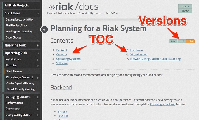
We have new avenues for finding docs, beyond the obvious primary navigation on the left. As you dive into the pages you may notice subtler forms. At the top of some longer docs, there exists a table of contents for fast navigation. And floating to the right is a version bar. This allows you to see versions of this document that apply to older versions of Riak.
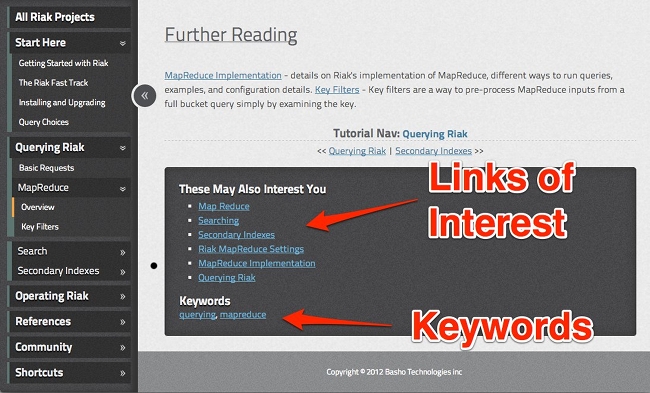
Once you read through a document, most pages have a secondary “These May Also Interest You” list of links you might also want to read up on.
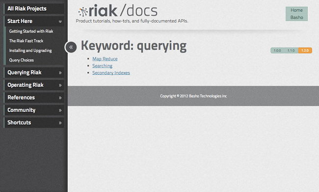
Most docs are also tagged with keywords. If you click one, you’ll be taken to an index of all documents with that same keyword for fast orthogonal navigation. Click on
Version History
One of the realities of managing docs is wrangling changes to the application between versions. If you’re not careful, your documentation can easily become out of date, or filled with warnings (note! this only applies to 1.2.x!). We were inspired by the way that Node.js managed their docs, keeping every previous version since the beginning of time and pointing the latest directory to the newest version.
This allows you to not only navigate back in time to older versions, but also helps reduce the chance of broken links and allows us to evolve the design over time without confusing those who are used to older document versions.
Complete Redesign
The docs don’t merely reflect Riak’s newer styles, but also an intent to give you the information you need to get things done. Collapsible nav is useful when reading out side-by-side docs (check out our Riak to Dynamo comparison work in progress).
A responsively designed site will shrink/hide items to take full advantage of smaller screens like iPads and smartphones.
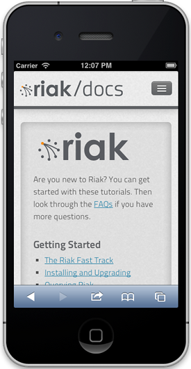
The design has other goodies, too, like a straightforward landing page, clear code samples, and easy to read type and font sizes.
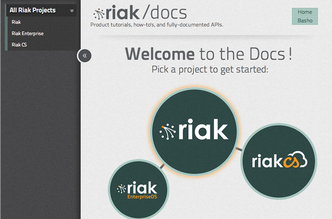
The navigation look and feel should also help clarify where you are in the documentation at all times, reducing the chance of getting lost.
Technology
Though not a primary concern for most Riak users, these docs were all build using Middleman 3, plus many of custom plugins and other magi-hackery.
Similar to the Riak wiki, the Riak documentation and code is open source, and is open for anyone to contribute. I also created a new FAQ Markup Language, called FML. All of our FAQs are written in this markup. The rest is largely markdown and Middleman’s frontmatter.
Riak Search
This isn’t out yet, but look for it within the week.
The old wiki site used Google to search through the static site, so we thought: why not use Riak?
We’re test driving the newest Riak Search functionality for some good reasons. Importantly, we use Riak Search to eat our proverbial dog food. But there’s a better reason: because the new search ended up being the best method for searching content with high uptime.
We wanted to search with facets, by version ranges for example. We wanted to extract metadata from each document’s frontmatter, so we created a custom extractor. Clearly we wanted full-text search. We wanted it to be fast and distributed, a core feature of the new search.
The new Riak Search leverages the real power of SOLR, with the benefit of Riak KV as a storage engine. One installation. One cluster to manage. No mess, no fuss.
We’re sorry to have to play teaser to this new search, but it will be out before you know it. (If you’re at RICON this week, you’ll be learning all about it.)
Thanks
So many people made these docs possible, there are literally too many to name them all here. But special thanks go to John Newman for his amazing design skills, Seth Benton and Brian Shumate for amazing work and eyes to detail. Justin Pease and the CliServ team for their hand in a realistic view of what users actually need; Mark Phillips, Shanley Kane, and the rest of Marketing for a strategic vision for these docs; Sean Cribbs and the Riak Engineering Team for working on version 1.0 of the docs; Ryan Zezeski for the new search, and the rest of Riak and our community for supporting this project.
This isn’t the Oscars, so I’ll just add, thanks go to everyone who had a hand in making these, including the community who worked to build Riak docs v1.0. Writing documentation might seem easy, but it’s a massive undertaking—and this is just the beginning.

